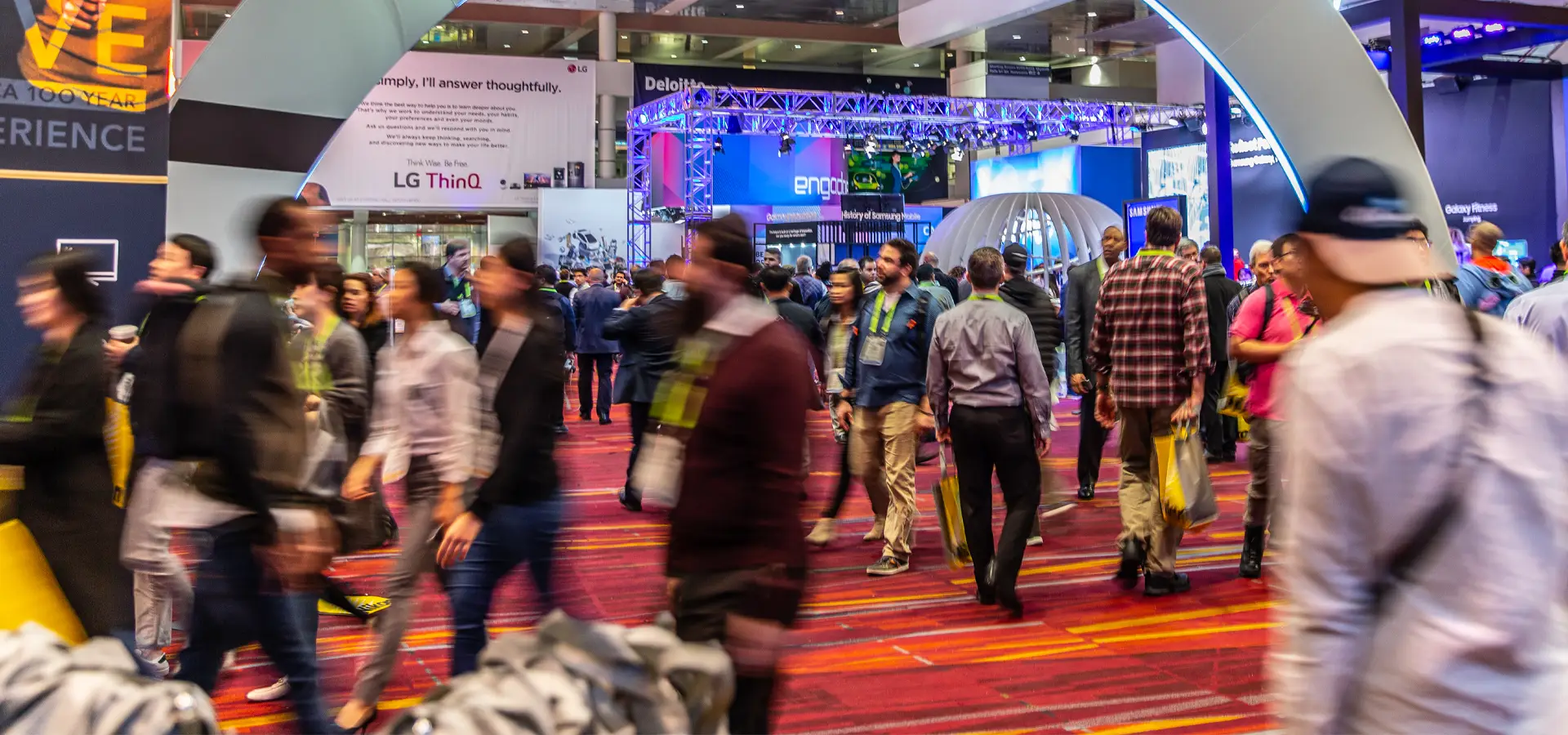
At a trade show, you’re competing for attention with hundreds of other exhibits. You only have a few seconds to grab the attention of your target audience, or they will pass by and may not return.
https://www.youtube.com/watch?v=DqMsQr_WBX4&t=2s
Booth design is critical to draw a crowd. Here are 5 things to consider when creating eye-catching booth graphics.
Message hierarchy
Your booth graphics have a job to do, and every word on your display is important. However, they are not equally important. Some messages should come before others. Some need to be bigger than others. Some don't make sense without reading the others.
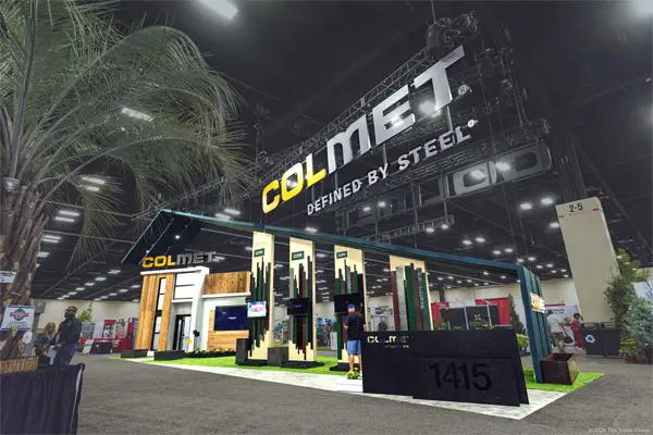
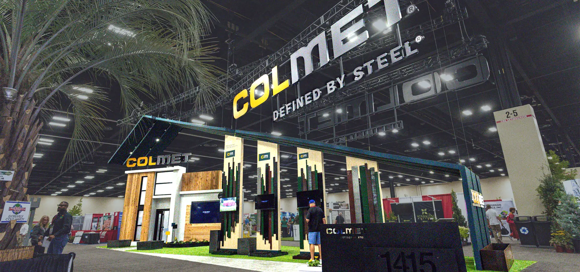
Thoughtful hierarchical design considers the target audience by prioritizing the images and messages most important to them. Often this is a company's name, logo, products, and services. However, there are instances when a marketing phrase takes priority.
Effective messaging hierarchy means messaging flows organically across a trade show booth. For example, attendees initially see large letters, placed as high as possible, that state clearly who you are, such as a company name or defining slogan. As they approach, you earn their attention with a big picture – literally and textually – of the benefit you bring. Attendees don’t drill down into the specifics of your products and services until they arrive at your exhibit.
Messaging hierarchy gives you an advantage over companies with confusing and haphazard exhibits.
High-quality images
At every show, you see trade show display graphics where something just looks off. Maybe it’s an image digitally zoomed into a pixilated monstrosity. Or a picture that’s so soft you’re convinced someone smeared petroleum jelly over it. Sometimes, a company’s logo is resized into a jagged, nearly illegible mess.
It’s hard to believe in a day and age when phones take high-resolution photos, but these mistakes continue to happen. Whether the wrong file was sent to the printer, or a last-minute change led to rushed quality control, low-quality images result in an unimpressive, uninspiring display.
A trade show exhibit’s images are often the first thing an attendee sees. Bright and crisp pictures are pleasing to the eye and draw in people. Fuzzy and pixilated images have the opposite effect.
[adguru adid="4635"]
Depending on the amount of distortion, attendee reactions range from indifference to discomfort and unease, like the “uncanny valley” effect produced by bad CGI. Plus, a booth that looks unprofessional sends a signal that your company is unprofessional and does shoddy work.
Legible fonts
Graphic designers: these folks think about fonts a lot. The rest of us usually just use the word processing program’s default. However, for eye-catching booth graphics, it’s critically important to think about fonts.
Fonts come in two main styles:
- Serif fonts have letters with small lines or “feet.” Designers often use these fonts for large sections of text
- Sans Serif fonts and literally “without serifs.” These fonts are frequently used for titles and headers because they’re difficult to read as body text
Fonts help tell a story and convey a mood. Script-like fonts are creative, romantic, and fun. Serif fonts evoke a sense of formality and tradition. Sans serif fonts are informal and modern.
Since there are thousands, if not millions, of available fonts, start the selection process by deciding what you want the font to communicate. Now type a few lines of Lorem Ipsum (jumbled text) and ask two questions:
- Does this send the intended message?
- Could an attendee read it?
That last question is crucial. If you select an elegant font, but Fs look like Qs, your message is confusing, and your visitor is annoyed. Don't forget the essential element is legibility.
Minimal text
Minimal text may feel counterintuitive because there are so many benefits to your products and services. However, an in-booth graphic is not the place to list all of them.
Your booth should make attendees want to learn more about your products and services. That will not happen with a bunch of text cluttering your display because they won't read it. It's your booth staff's responsibility to convey every remarkable aspect of your business. The only job of your exhibit is to encourage attendees to visit.
Your logo, business name, a short motto, and (maybe) a few descriptive bullet points are the only text you need.
Also, always have at least one person review the final task for mistakes. Spelling errors happen all the time. When a typo occurs in an email, it's slightly embarrassing, but that's it. However, when an error makes it into print, there's no going back – especially when that misspelling is two feet tall.
Pleasing colors
Colors have a subconscious effect on people. Research from Oxford University found that color changes how we perceive flavor. The study had people drink the same hot chocolate from different colored cups. Those who drank from orange cups found that the beverage had the strongest flavor, while cream-colored cups increased sweetness and aroma.
Of course, colors also influence people’s moods and perceptions.
- Blue is associated with water and sky and encourages tranquility and calm
- Green, associated with nature, is another calming color
- Red is associated with energy and power; there’s a reason the “power tie” is red
- Orange, associated with warmth and joy, is a social color
- Yellow is associated with cheer and optimism and encourages positive thinking
- Violet and purple are associated with richness and sophistication. These colors stimulate the problem-solving areas of the brain and promote creativity
- Neutrals (grey, beige, and brown) are associated with warmth and quiet and often offset or soften brighter colors
For eye-catching booth graphics, select complementary colors or varying shades of the same hue. Also, use a light-colored font on a dark background or vice versa; otherwise, your message can fade into the backdrop. Remember that the colors used for your booth graphics are equally important as images and text.
Need help creating eye-catching booth graphics? Talk with one of our design pros to explore your options.
The Trade Group is a full-service trade show and event marketing company. We will work with you to create an exhibit or an event that brings in leads and helps you achieve your business goals. Contact us here or give us a call at (800) 343-2005.