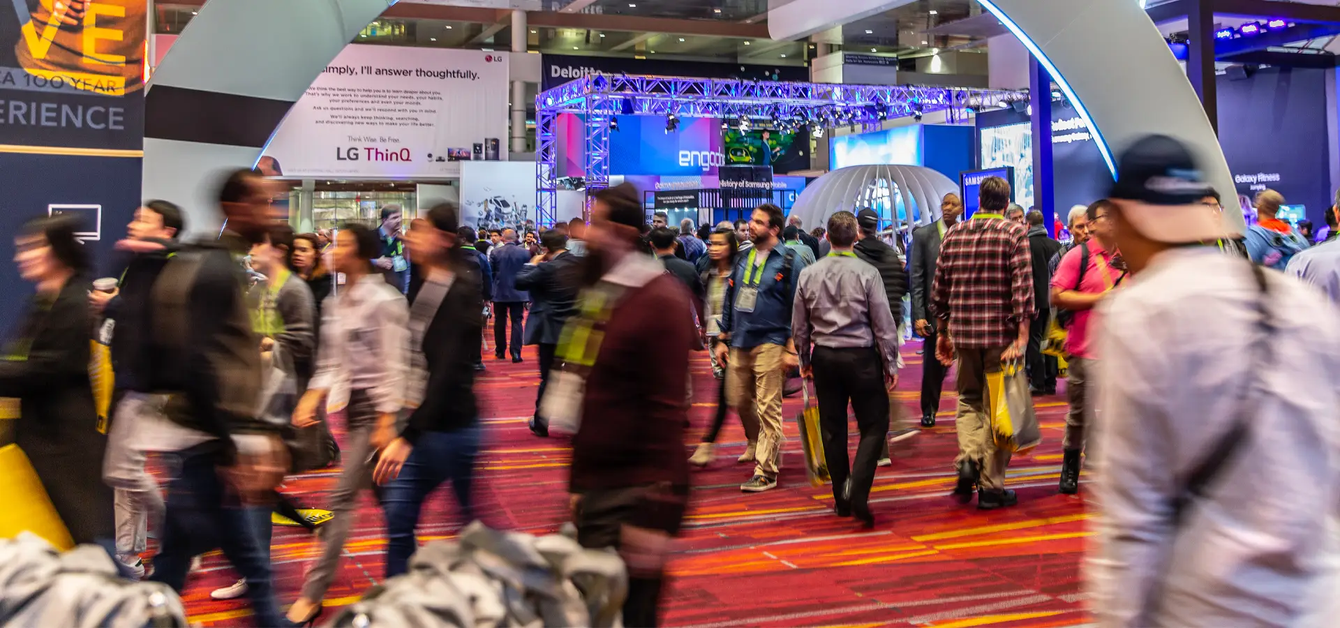

As a rule of thumb, you only have between three and seven seconds to grab a passerby’s attention at a trade show.
Once those three to seven seconds have passed, that passerby is going to be one of three things—uninspired, confused, or intrigued.
If you’d prefer outcome three to the other two outcomes, you’ve come to the right place.
We sat down with Mike Graziani, our Vice President of Design, to find out which design mistakes you need to fix in order to maximize your booth’s performance at your next show.
1. Not indicating the budget you want to work with
While this mistake isn’t specifically related to the design element of your booth, not being clear and transparent about your budget from the get-go can complicate things when we reach the design and fabrication stage of your project.
Not providing a number could lead to one of two outcomes:
- You get a design that feels underwhelming versus what you were expecting (when in reality, what you had in mind was more expensive than the budget you stated).
- Your exhibit house could end up designing something that's very extravagant, but exceeds your budget and needs to be stripped back, so you’re unable to retain the attributes that made the designs so appealing in the first place.
From our perspective, if the client doesn’t provide a budget, we’ll give them a ballpark figure for what we think their booth will cost, and we’ll go from there based on their response. We can usually agree on a number pretty quickly once this information is all out in the open.
2. Inconsistencies around your messaging
This point can be broken down into three areas. These are the biggest mistakes clients make when they brief us on what they want their booths to look like.
a. Not clearly stating what your company does
There’s a very good chance that not everybody attending the show will be familiar with who you are, so clearly communicating your offer from the get-go is essential.
b. Not focusing on your differentiators
There are a lot of cliches in the business world. We hear them all the time.
“We’re global.”
“We’re fast to market.”
“We’re customer-focused.”
These are the same things that almost every other company in your industry are saying.
That’s why we often say to our clients, “Let’s pretend we're at the show right now. I just visited your two competitors, who are just two exhibits away. Now I'm coming to see you. Why should I deal with you instead of them?”
Attendees want to know what your differentiators are. What are the details that will truly strike a chord with people, as opposed to the generic messaging they hear all the time? Even the most seemingly trivial details might be very interesting to someone from outside your ‘bubble’.
If you can draw out these details in your design—rather than the things people take for granted or don’t pay attention to—you’ll have a much more focused presentation and make a much bigger impact.
c. Saying too many things
It might feel tempting to convey absolutely everything there is to know about your business in your booth design, but we would strongly advise against this approach.
We have clients who want to list everything on a translucent screen or have it represented photographically. For example, they feel the need to include messaging about worldwide shipping capability in their design.
In their minds, they’ll lose out on a sale if they skimp on certain details. Even our long-standing clients have this fear.
But we always say the same thing to them—just focus on your differentiators that set you apart from your competitor. That’s the fundamental thing you need to do.
If you’re still not entirely clear on what those differentiators are, that’s where we come in. We’ll ask the right questions and use our creative capability across the team to find what makes your company unique.
3. Trying to represent multiple brands under one umbrella
If your business is a parent company with multiple brands underneath it, you could run into a common problem.
Your ideal customer—the person you want to talk to at your next show—doesn’t know who the parent company is, because it’s never represented. And yet, it still gets top billing in your booth, with each of the individual brands simply becoming small exhibits within that floor space.
The brands might not share any characteristics. They may have completely different color schemes and target audiences.
Therefore, if you try and mix them all together, you end up with no unification between those different brands. It just looks like separate small exhibits rather than one big, unified one.
4. Insisting on accessibility from all sides of your booth
We get it.
You think that if you close off one side of your exhibit, people are going to walk past it and not bother walking in.
You’re not the first person to think this, nor will you be the last.
But trust us—this theory doesn’t make much sense.
If your booth designs are strong and there’s something compelling happening on the wall that you've built, the visitors will come. Accessibility from all sides is secondary.
Let’s say you have an island exhibit that's very open. Maybe it has a tower in the middle and small kiosks on each of the four corners. (We call this a hub and spoke arrangement.)
It can look very nice on a rendering, because you’re seeing it on a black background.
But if you put that on the trade show floor, there's not a lot of structure there.
If someone is viewing this exhibit from a distance, they’re going to look through that exhibit to whatever is behind it. This is because there’s nothing stopping their eye and keeping it in your exhibit.
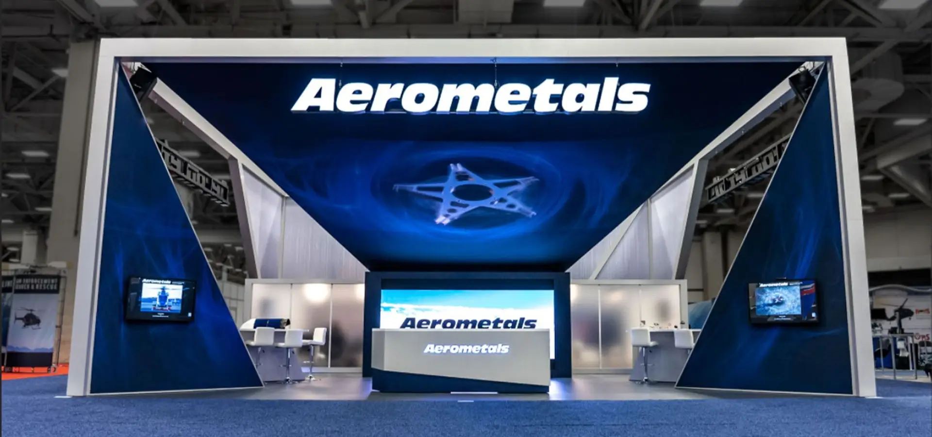
Therefore, you need to create enough wall structure at the rear of the exhibit to hold the viewer’s attention.
This is where a visual backstop comes in.
Having a visual backstop will create a sense of enclosure and ensure that your ideal customers are looking into the exhibit, not beyond it.
An example of a visual backstop
5. Overestimating configurability
This point is all about understanding the need for compromise.
If you want assurance that your booth will reconfigure to almost any other size, then the short answer is—yes, it can.
But for every configuration that’s made, you’re compromising the existing configurations, and your booth becomes much more generic.
Let’s say you have three island exhibits—a 20x50, a 20x30, and a 20x20. You also have two inline exhibits—a 10x30 and a 10x20.
Inline exhibits are a completely different animal from an island exhibit. They can be up to eight feet tall, and they aren't allowed to contain hanging signs, and so forth.
The components that make up inline exhibits are almost at an entirely different scale and proportion compared to island elements.
Again, this is not to say configurations can’t be made. But if they are, you could end up having to lose something from the original concept.
6. Assuming your product or service will carry a cheap booth
There are two important points we want to make here:
1. Not everybody is going to buy into your sweat equity.
2. You can’t get away with trying to justify cheapness.
Let’s explore these points in more detail, starting with point 1.
Some exhibitors are so fixated on their whitepaper or whichever product they’ve cooked up in their lab that they assume the rest of the world is going to be blown away by it, irrespective of the designs that support it.
This is a common misconception among entry-level exhibitors. They refuse to believe that they have to have a slick, professional package. They say words to the effect of, ‘My product's just so good, I don't need that.’
That's not true. People aren’t as emotionally invested as you are in what you’ve created or how you’ve created it.
Re. point 2—we’ve had conversations with exhibitors who’ve claimed that having a very expensive booth design sends the wrong message to potential customers. It shows that they’re willy-nilly with money and that they’re not going to be a good steward of their money.
If you’ve ever thought this, we can tell you with 100% certainty that this is not the case.
Here’s the thing. Most of your ideal customers will never see your brick-and-mortar location. They'll never see how well you run the company.
So, you need to create some kind of figurative stand-in.
But if the fit and finish on your exhibit is poor, they're going to assume that:
Your fit and finish at your brick-and-mortar location is poor.
Your activities are poorly managed.
You're not sweating the details.
Ultimately, it’s a poor reflection of your business, whereas your booth should be an investment into creating brand trust and securing sales opportunities with the right kinds of customers.
7. Not making the designs interactive enough
Eye-catching creative is great, but it can only get you so far.
Something like kinetic video tiles will get you much further. These tiles are arguably the biggest head-turners we see at trade shows. They’re small, motorized LED or LCD panels arranged in a grid. They can tilt, rotate, or shift in synchronization with video content or attendee movement.
You could also look at creating LED video walls or workstations featuring translucent video screens.
Whichever route you choose, make sure there’s a link back to your brand design and core messaging.
Always be strategic.
Avoid the above mistakes by working with The Trade Group
We listed seven mistakes above, but we could have listed many more.
We’ve seen exhibitors make their fair share of mistakes with their trade show booths over the years, having been in business since 1986.
These mistakes are not only expensive but could also be detrimental to a business’s reputation and cause it to lose vital ground on its competitors.
Good thing you’re not one of these exhibitors, then.
If you’re ready to exhibit the right way, prevent avoidable mistakes, and make your business stand out with an immersive storytelling asset, we’re ready to help you do this.
Whatever type of booth design you’re looking for, and whatever goal you’re looking to achieve, our expert team ensures unique and impactful brand experiences that connect you to your client. Call us today at 800-343-2005 to get the ball rolling.